The Tsunami Game


In all, I did better on my first round of the game than I originally thought I would. The clues were informational to tell which defense mechanisms worked best, and where to build structures, place trees, etc. In the end there were 62 people injured, 61 people killed, and $4,000 worth of damages.
One thing I could have done better is made more housing available for the community.

For the second time around playing the tsunami game, the goal was to kill as many people as possible as well as cause as much damage as possible. Instead of building sturdy structures such as hospitals and schools, I placed bamboo huts right on the beaches in the community. I also took away as many trees as I could, and did not put in a seismograph, or an alarm system to warn the community of any dangers. By minimizing housing and safety measures, 72 people died, 70 were injured
and there were $5,450 in damages.

This is a picture from the flood game I played next for this assignment. To try and minimize deaths and damages, I built a hospital higher up in the community and had a drainage system put in to try and eliminate flood damages. I also waterproofed homes, and built rock walls by the water to try and prevent flooding. Next I put in an alarm system and evacuation plan in the community center.
The Earthquake Game

The next scenario I tried on this website was an earthquake. One preventative measure I took was to retrofit all of the buildings to help them withstand the power of the earthquake. I also put in an alarm system and radio system in the community center, had evacuation signs put in, and purchased a training course to educate people about earthquakes and safety measures that should be taken. Along with that I built a hospital and more housing for people.
ARCGIS Map

ARCGIS Map: Lab 3

This is a map that corresponds with a lab done in class. This map shows earthquakes that have occurred worldwide from 1970-1993. During this lab I also utilized querying capabilities, and researched information such as how many people live in areas at risk for large earthquakes, and where the most earthquakes occur. This data takes an engineering approach when referring to the environmental hazard paradigms because it shows data that is useful in determining which areas are most likely to be affected by earthquakes, and in return, which areas are at higher risks for environmental hazards such as landslides and tsunamis. If this data were to take a more complexity based approach, it would have to show the relationship between society and the environment, such as death tolls and costs of damages due to earthquakes.
Colorama
While the drought in Wisconsin may be affecting the colorama in other parts of the state, the trees here in Eau Claire are looking beautiful! For more information on the drought and it's effects on the leaves changing color this fall, visit my blog post from 9/10/12.

Lab 4: Drought
 |
| This is a drought forecast for September- Novemeber 2012 using the Palmer Drought Severity Index. |
Current Crop Yields
 |
This map shows current crop yields which is affected by many conditions, such as climate & drought.  |
This map shows the shaking hazards and presence of quaternary deposits in the United States.

While
looking at the different layers of this map, you can see that all three are
directly correlated. Building status, density, and liquefaction all show
patterns relating to one another. For example, the more liquefaction in an area
and the higher the damage density, the more unsafe the building status is.


Photo Credit: Patrick Chappatte, NY Times
After little discussion on the environment during the presidential debates, I found this comic interesting and relevant to this years election. Visit my blogs to see more on the presidential debate and the topic of global warming.
Popularity Contest: Who Erupts The Most

This map shows the 5 countries which have had the most volcanic eruptions. (Indonesia, Japan, United States, Italy, Russia).
Mount Rainier Lahar Flows

A potential impact of a lahar in
this area would be the delivery of disaster aid. If/when the lahar flows on to
roads and railways, emergency crews and disaster relief would not be able to
get to victims.
DEM AND TIN IMAGES

Here are examples of a DEM and TIN image. The TIN image looks more jagged and doesn't have as smooth of a picture.
Topographic View

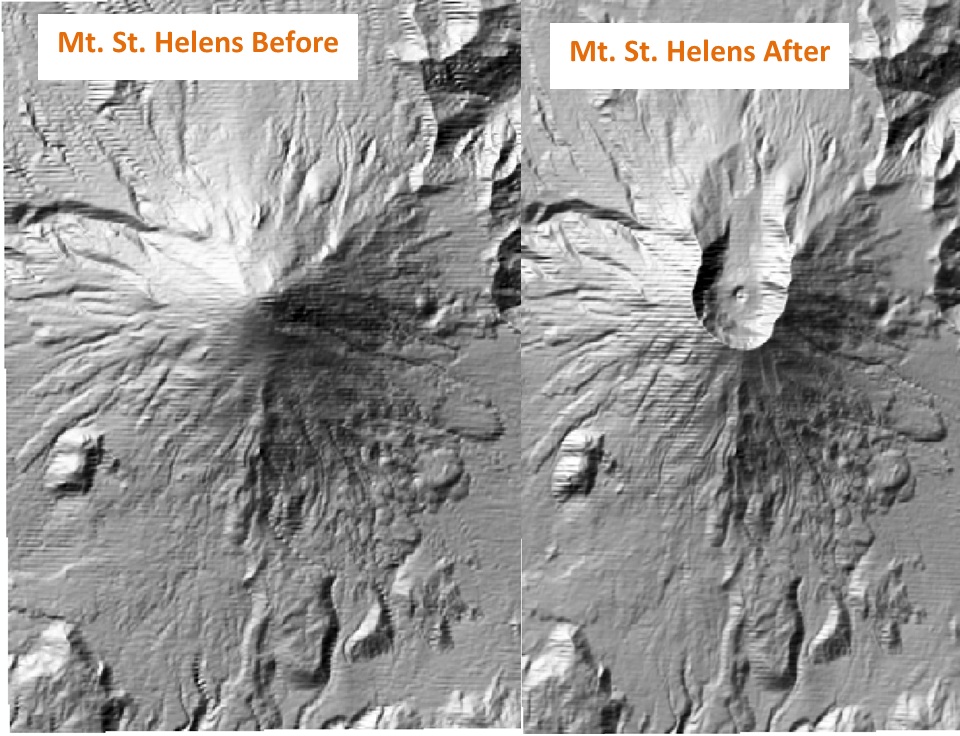
Mount St. Helens Before and After
Total Volume Loss- Mount St. Helens

Risky Regions

This map shows 5 areas in the United States that have a high risk of landslides. These areas include: The Rocky Mountains, the west coast, the Bitteroot Range, and the Blue Mountains. According to Keith Smith and David Petley, authors of Environmental Hazards, landslides occur in the 5 following types of terrain:
1. Upland areas subject to seismic shaking
2. Mountainous environments with high relative-relief
3. Areas of moderate relief suffering severe land degradation
4. Areas with high rainfall
5. Areas covered with thick deposits of fine grained material

Slope Angles and Risk
This map shows the slope angles of a given area. Areas shaded black have a slope angle of 30%. Areas shaded grey have a slope angle of 60% and areas shaded white have a slope angle of 90%.

Parcel Damage Due to Stream Flow and Rain Volume

100 Year Flood-EC
 This is a map depictinga 100 Year flood in Eau Claire, Wi. This does NOT mean that this flood will occur every 100 years, but rather that it has a 1/100 chance of occuring. For this portion of the lab, I looked at which University of Wisconsin-Eau Claire buildings would be effected by this flood. I also looked at different zoning methods of the city.
EC Flooding- 790 feet & 800 feet
The following two maps were generated to show a map generated for 790 feet (first map) and 800 feet (second map) in Eau Claire, Wi. As the pictures show, floods like this would cause a lot of flood damage to the surrounding area.


3D View- 100 year flood EC

Facilities At Risk
 This map shows the facilities near the cities of Oxnard and Ventura that are at risk of a tsunami. There are 51 total facilities that are at risk.
Storm Surge


EC Flooding- 790 feet & 800 feet
The following two maps were generated to show a map generated for 790 feet (first map) and 800 feet (second map) in Eau Claire, Wi. As the pictures show, floods like this would cause a lot of flood damage to the surrounding area.


3D View- 100 year flood EC
This is a map created in ArcScene showing a 3D map of a 100 year flood in Eau Claire, Wi. For this part of my lab, I looked at 3D models of the University of Wisconsin- Eau Claire campus to see which building would be affected first in this situation. I also looked at which buildings are not in the flood zone area (upper campus) and the type of land these areas have in terms of shape.
Facilities At Risk

Storm Surge

This map shows the water depth and elevation of a category 3 inundation zone in the southwest area of Florida near Naples. The stronger the hurricane is, the higher the storm surge. Along with this, (as seen in purple) the higher the storm surge (darker) the lower the elevation level of that location is.
No comments:
Post a Comment